Visual quality often fails when the sun goes down. Most users notice ugly color bands or blocky shadows during nighttime viewing. Consequently, these artifacts ruin the professional look of your digital content. The secret to smooth, realistic images lies in the grayscale depth. High-end LED plakkaat vertoon skerms now offer 16-bit processing for superior clarity. This guide explores why bit depth matters most at low brightness levels. We help you choose the right tech for perfect 24-hour performance.
1. Understanding Grayscale: The Key to Visual Precision
Om vertoningskwaliteit werklik te waardeer, moet jy eers grysskaal verstaan - die grondslag agter elke kleuroorgang wat jy op die skerm sien. In eenvoudige terme, grysskaal definieer hoeveel vlakke van helderheid 'n skerm kan produseer, wat direk beïnvloed hoe glad en natuurlik 'n beeld lyk.
Die wetenskap agter gladde oorgange
Byvoorbeeld, 'n 14-bis-stelsel genereer 16 384 helderheidsvlakke per kleur, wat voldoende presteer vir standaard dagadvertensies onder sterk omgewingslig. Wanneer jy egter opgradeer na 16-bis-verwerking, lewer die stelsel 65 536 vlakke per kleur. As gevolg hiervan kry elke pixel vier keer die akkuraatheid, wat aansienlik gladder gradiënte moontlik maak. Gevolglik skep die verhoogde aantal "stappe" tussen swart en wit meer verfynde oorgange en 'n sigbaar hoër kwaliteit beeld.
2. Die Lae-helderheidsuitdaging: Waar 14-bis tekort skiet
Soos beligtingstoestande verander, veral in die nag, moet skerms helderheid verminder om glans te voorkom. Alhoewel hierdie aanpassing die kykgerief verbeter, stel dit ook die beperkings van laer grysskaalstelsels bloot.
The Problem of Color Banding
When a 14-bit screen dims, it rapidly loses effective grayscale levels. As a result, it struggles to render subtle gradients in darker scenes, such as night skies or shadowed areas. Instead of smooth transitions, viewers notice visible “steps” or contour lines—commonly known as color banding. Moreover, these imperfections make high-definition content appear less refined, reducing the perceived quality of the display. Therefore, lower-bit systems often fail to maintain visual consistency in low-light environments.
The 16-bit Advantage in Low-Light Conditions
In contrast, a 16-bit LED poster display maintains exceptional precision even when brightness drops to as low as 10%. Because of this, it preserves fine details and delicate textures in darker regions without crushing blacks or losing depth. Furthermore, it ensures that gradients remain smooth and natural, regardless of ambient lighting conditions.
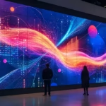
Ultimately, by delivering consistent image quality day and night, 16-bit technology sets the benchmark for premium visual performance—making it the preferred choice for high-end retail spaces, boutique environments, and street-level advertising where brand image matters most.
3. Performance Comparison: Nighttime Visuals
| Kenmerk | 14-bit LED Screen | 16-bit LED Screen |
| Total Shades | 16,384 per color | 65,536 per color |
| Dark Detail | Moderate (Some loss) | High (Full preservation) |
| Color Banding | Visible in shadows | Virtually invisible |
| Nighttime Feel | Flat and digital | Deep and cinematic |
Consequently, the 16-bit option delivers a much more realistic viewing experience. LED plakkaat vertoon skerms with high bit depth attract more eyes after dark. Furthermore, the smooth transitions prevent eye fatigue for viewers walking past your shop. Therefore, you protect your professional reputation during every hour of operation.
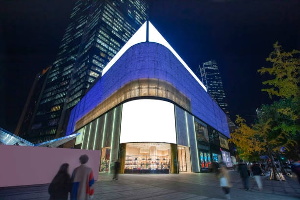
4. Why Grayscale Matters for Your Brand
Consistent quality builds trust with your high-end audience.
Realistic Skin Tones: Avoid “patchy” faces in evening portrait ads.
Deep Contrast: Maintain a true black background for luxury products.
Smooth Gradients: Keep your sky and water backgrounds looking natural.
Consequently, your digital posters will always look like high-quality printed magazines. LED plakkaat vertoon skerms with advanced drivers provide the best ROI for luxury retailers. Furthermore, they allow for much finer color calibration during the initial setup. Therefore, you achieve the exact brand colors required by your corporate identity.
Conclusion: Master the Dark with Precision Tech
Nighttime advertising is the most competitive space for modern visual brands.
Stop settling for blocky, low-quality images that disappear in the shadows. Instead, embrace the 16-bit precision of professionele LED plakkaat vertoon skerms. Consequently, your content will stay sharp and vibrant even at low brightness. Experience the difference that true grayscale depth makes for your business today. Your brand deserves to shine clearly from sunset to sunrise.
Gereed om u handelsmerk te verhoog met presisievertoonoplossings?
Of jy nou soek buitelugtekens met hoë helderheid, interaktiewe kleinhandel kiosks, of 'n heeltemal pasgemaakte LED-integrasie, is ons ingenieurspan hier om jou visie in 'n hoëprestasie-werklikheid te vertaal.
Kry jou persoonlike kwotasie vandag
Hou op om vir generiese skerms te soek. Kry 'n oplossing wat pasgemaak is vir jou spesifieke omgewings- en funksionele vereistes.
[Get a Free Project Consultation & Quote]
Facebook: https://www.facebook.com/DKING.DISPLAY/